DATA PRESENTATION
CONTENT
(i) Line graph (ii) Bar graph (iii) Histograms(iv) Pie Chart (v) frequency polygon (vi) Deductions and Interpretations.
LINE GRAPH
Line graphs are used to show trends over a period of time and have the advantage that they can be extended. To draw a line graph, plot the given data as a series of points and then join the points together by straight lines. The lines can be drawn vertically or horizontally and have no thickness.
Example 1
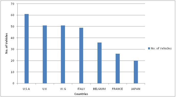
A comparison of traffic densities in a number of countries produced the following results.
Present the data in a line graph
Solution:
Example 2:
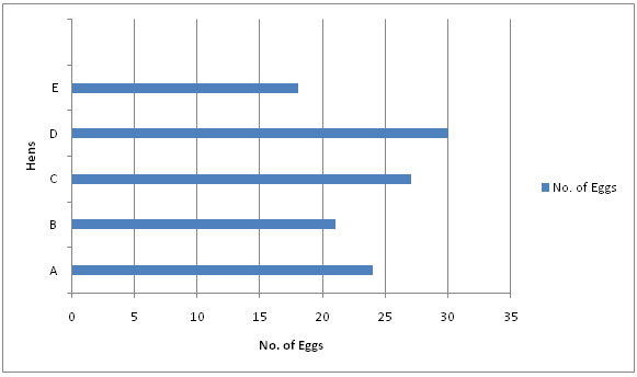
The table below shows the number of eggs laid in one month by 5 hens. Draw a horizontal line graph for the data.
Class Activity:
1. The student population of the Federal Government college Kano was recorded as follows.
Plot the line graph of the above data.
- NEW: Download the entire term's content in MS Word document format (1-year plan only)
- The complete lesson note and evaluation questions for this topic
- The complete lessons for the subject and class (First Term, Second Term & Third Term)
- Media-rich, interactive and gamified content
- End-of-lesson objective questions with detailed explanations to force mastery of content
- Simulated termly preparatory examination questions
- Discussion boards on all lessons and subjects
- Guaranteed learning